Houseplant Compatibility and Color Schemes: Unveiling the Art of Matching Plant Hues with Room Colors
In the world of interior design, houseplants are not just green additions to your living space. They can be the perfect canvas for a vibrant and harmonious color palette. Here are some effective color pairings for different shades of houseplants, as suggested by design experts.
Light Green Plants
Light green plants, such as neon pothos or lemon-lime philodendron, pair beautifully with delicate whites, powder blues, and muted pinks. These soft, airy tones enhance the freshness of the foliage and suit minimalist or Scandinavian interiors where subtlety is key.
Rich, Deep Green Foliage
Rich, deep green foliage, such as bamboo or tropical plants, contrasts strikingly with saturated blues, particularly cobalt blue. This bold combination creates high contrast and a purposeful statement; adding black or coral accents can balance the palette.
Dill Green Shades
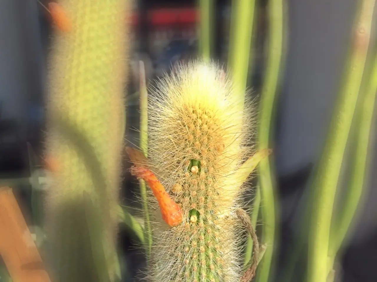
Dill green shades work well with neutrals for safety but can also be paired with complementary blues, pinks, oranges, or tones of green like olive to add complexity and personality to a space. Such combinations are lively and suitable for kitchens or butler’s pantries.
Variegated Plants
For houseplants with more delicate green hues or variegated white-and-green leaves, pairing with understated or neutral colors in pots and rooms supports a subtle, harmonious look. Brightly colored foliage or flowering plants in pink, yellow, or red can create bolder statements.
Additional Color Combinations
| Plant Shade | Recommended Wall Colors/Combos | Notes | |----------------------|-------------------------------------------------|-----------------------------------------| | Pale/light green | Delicate white, powder blue, muted pink | Creates calming and fresh atmosphere | | Rich deep green | Saturated cobalt blue, black, coral accents | Bold, high contrast, intentional look | | Pistachio green | Soft yellows, whites | Playful, lively without overwhelming | | Olive/dill green | Neutrals, blues, pinks, oranges | Adds warmth and harmony | | Neutral pots/accents | Terracotta, rustic earth tones | Adds cozy, natural feel to greenery |
Notable Design Experts
Evelina Juzėnaitė, the principal designer at Planner 5D, curates the Design School and weekly Design Battles. Jen Baxter, with a background in home renovations, collaborates with architects, craftspeople, and vendors, specialising in creating bespoke interiors that enhance wellbeing. Guillame Drew, an interior designer, established Or & Zon, a company focused on providing real products made by real people. Jen is currently pursuing formal training at the New York School of Interior Design.
By playing with complementary (opposite on the color wheel) and analogous (neighboring on the wheel) colors, you can enhance the visual appeal of houseplants in interiors. Light greens favor softer pastels and whites, while deeper greens contrast well with blues and warm accents.
- A minimalist living room decorated with Scandinavian interior-design principles could feature light green plants, such as neon pothos or lemon-lime philodendron, paired with delicate whites, powder blues, and muted pinks.
- For those wanting to make a bold statement, rich, deep green foliage, like bamboo or tropical plants, contrasts strikingly with saturated blues, particularly cobalt blue, and can be balanced with black or coral accents.
- In a kitchen or butler’s pantry, dill green shades can be paired with complementary blues, pinks, oranges, or olive to add complexity and personality, making for a lively and harmonious space.
- Variegated plants with delicate green hues or white-and-green leaves can be paired with understated or neutral colors in pots and rooms for a subtle, harmonious look, while brighter colored foliage or flowering plants in pink, yellow, or red can create bolder statements.
- To liven up a living space, next to a variegated plant or houseplant, you might consider adding tiles or decorative elements with terracotta or rustic earth tones, adding to the cozy, natural feel of the greenery.
- Design experts, like Evelina Juzėnaitė, Jen Baxter, and Guillame Drew, suggest playing with complementary and analogous colors to enhance the visual appeal of houseplants in interiors; light greens favor softer pastels and whites, while deeper greens contrast well with blues and warm accents.


